Vigo
CLIENT: VIGO
ROLE: DESIGN AND ARTWORK
DISCIPLINE: BRANDING, PRINTED LITERATURE, APPLICATION (interior/exterior/vehicle), MARKETING
Designed at Toucan
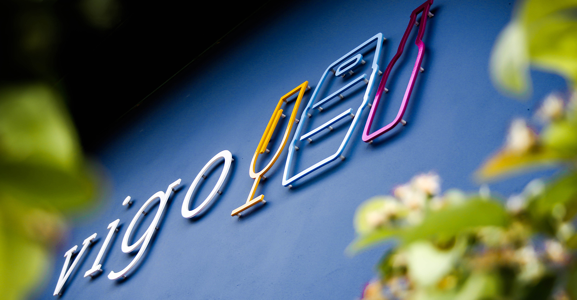
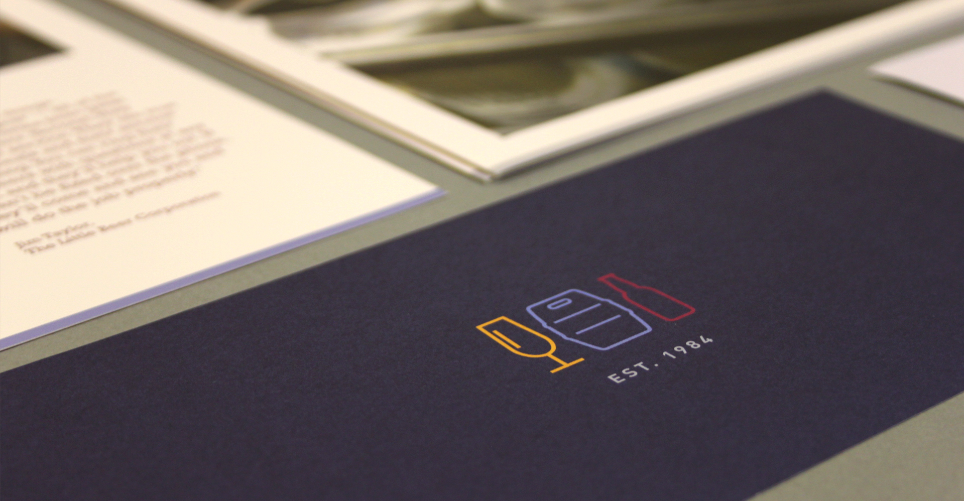
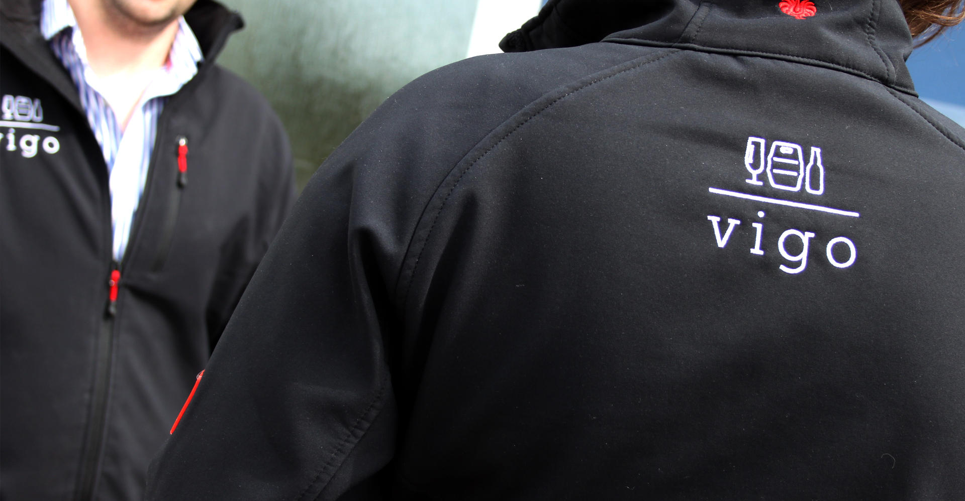
Vigo were in need of a rebrand and Harriet was tasked with the job of ‘bringing their company into the 21st Century.’ Vigo offer high quality drink production equipment, with specialist engineers offering technical advice. With over 30 years experience, Vigo needed to feel slick, fresh and contemporary. Branding, logo development, printed literature, adverts, vehicle application and interior design were launched and rolled out.
What the client said
“Harriet was the designer behind our logo, which was part of a wider rebranding project. She came up with a number of different designs in response to the results of the rebranding workshops. The design we chose was surprisingly the one which challenged our perceptions the most. It is clean and contemporary; daring in its understatement, yet confident and assured in terms of the colour pallet. It gave us a strong springboard to express what we stand for, and it continues to give us the freedom to evolve. I can’t image Vigo without it now.”
Camilla Bridewell – Marketing Manager, Vigo
Brand Transformation
Creating A Brand Identity.
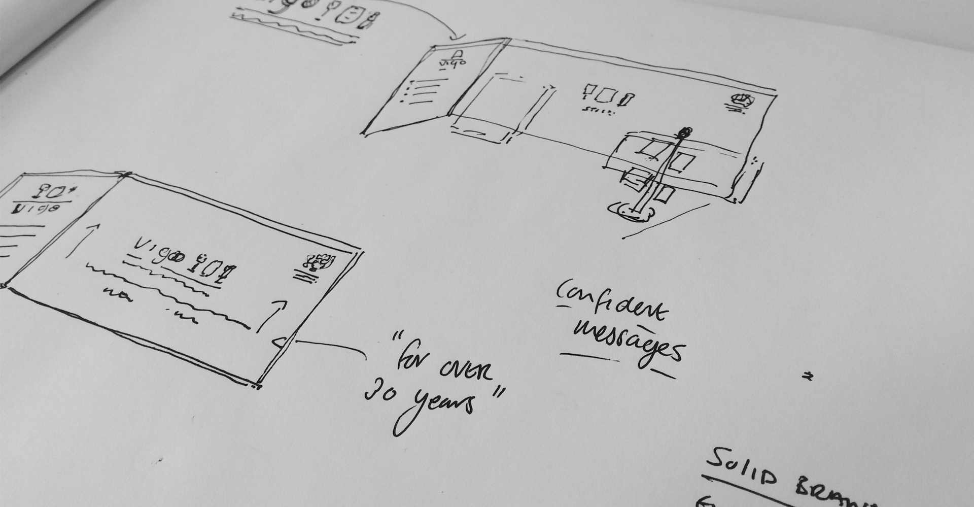
The first step was to determine where Vigo stood in the marketplace and to understand who their customers were and establish the value proposition and messaging statements. We formed a systematic visual language around the logo — one that compliments the design thinking of the logo and offers a family of useful, flexible elements that will help to design marketing and business collateral.
Consistent Messaging.
Giving customers a dependable experience across all of Vigo’s communication was critically important. We created a brand that had trust at its heart and created a tone of voice to provide consistent messaging.
